Data Visualization: Personal Sleep Data Model and Analysis
Overview
This project focused on visualizing personal data related to my sleep patterns over two weeks. The primary objective was to understand how different pre-sleep activities, sleep duration, and interruptions during the night impacted my overall sleep quality and morning tiredness. I approached this project by designing a physical data visualization using origami, where different shapes, colors, and textures represented key aspects of my sleep. The final design took the form of a mobile, symbolizing the theme of sleep, and served as a creative way to interpret the collected data.
The whole design process and reflection has been written out below, or, for your viewing pleasure everything has been summarized in the following 3-minute long video.
Data Collection
I had a lot of different ideas on what personal data I could have collected: cellphone usage, online communications, different genres of music, moods at differing times of the day, etc. I ultimately ended up choosing to visualize my sleep patterns as it was an aspect of my life I wanted to visualize and understand better; especially how interruptions during the night affect me.
For two weeks, I recorded several data points about my sleep habits. These included:
- What I did in the hour before going to bed
- The time I went to sleep and woke up
- Sleep quality
- How often I woke up during the night
- How tired I felt upon waking
This data helped raise several questions:
- Does screen time before bed impact my sleep quality?
- Is there a correlation between sleep duration and perceived sleep quality or tiredness?
- Do interruptions in the night have a significant effect on sleep quality?
Using a journal, I manually tracked this data, noting down any relevant observations to gain deeper insights into my sleep habits. The goal was to identify any patterns that might explain why my sleep quality varied day to day. Surprisingly, on the paper record of all the data points I didn't see any clear patterns or trends.
Design Ideation
For the visualization, I decided to step away from traditional graphs and charts, opting instead for a physical representation of the data. I explored and sketched out many different idea. The runner up idea to my final pick was a paper flower garden where the height of the stems and size/types of flowers represented different data points. I ended up choosing to design a mobile because it reflects the delicate balance of sleep.
Each element in the mobile was thoughtfully mapped to a different aspect of the data:
- Origami butterflies represented nights without screen time, while cranes represented nights with screen time.
- The color of each origami shape indicated sleep quality: green for good, blue for moderate, and pink for poor.
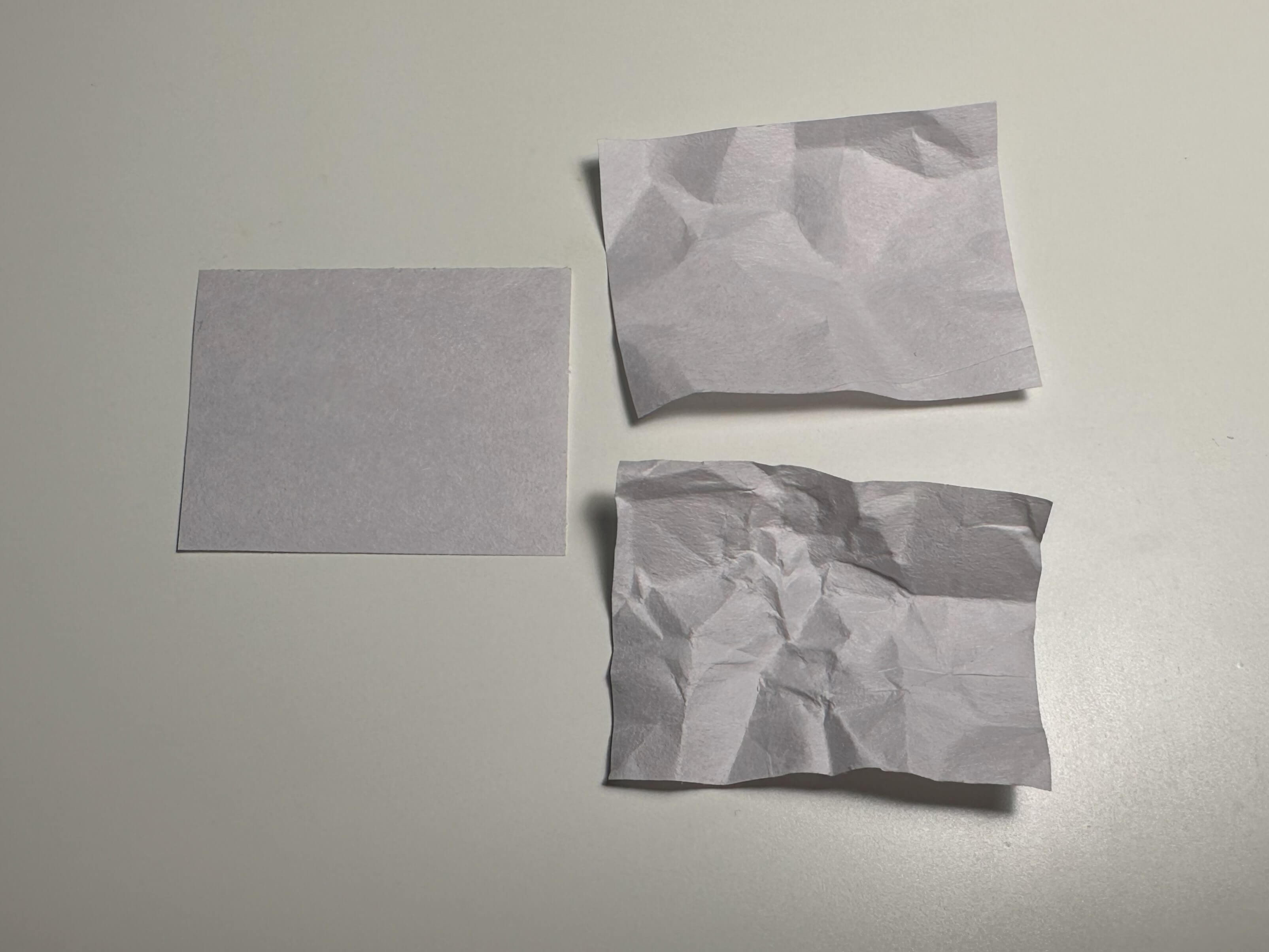
- The texture of the paper reflected my level of tiredness upon waking—crumpled paper symbolized greater tiredness.
- The length of the string (starting at 12AM) corresponded to the duration of sleep, with each inch representing one hour.
- The origami is placed at the time that I went to bed and slept.
- Small yellow stars along the string represented interruptions, marked with the exact time I woke up during the night.
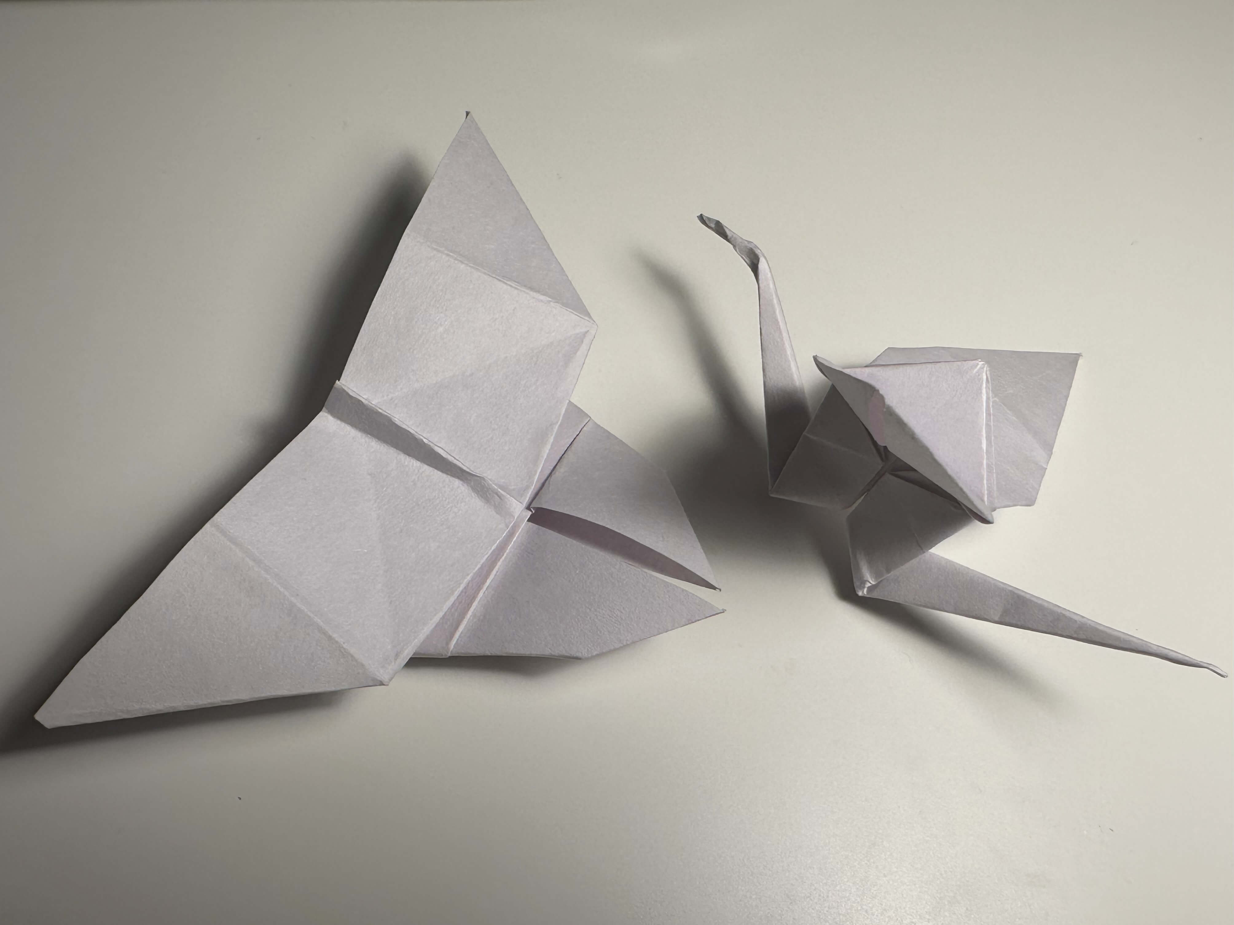
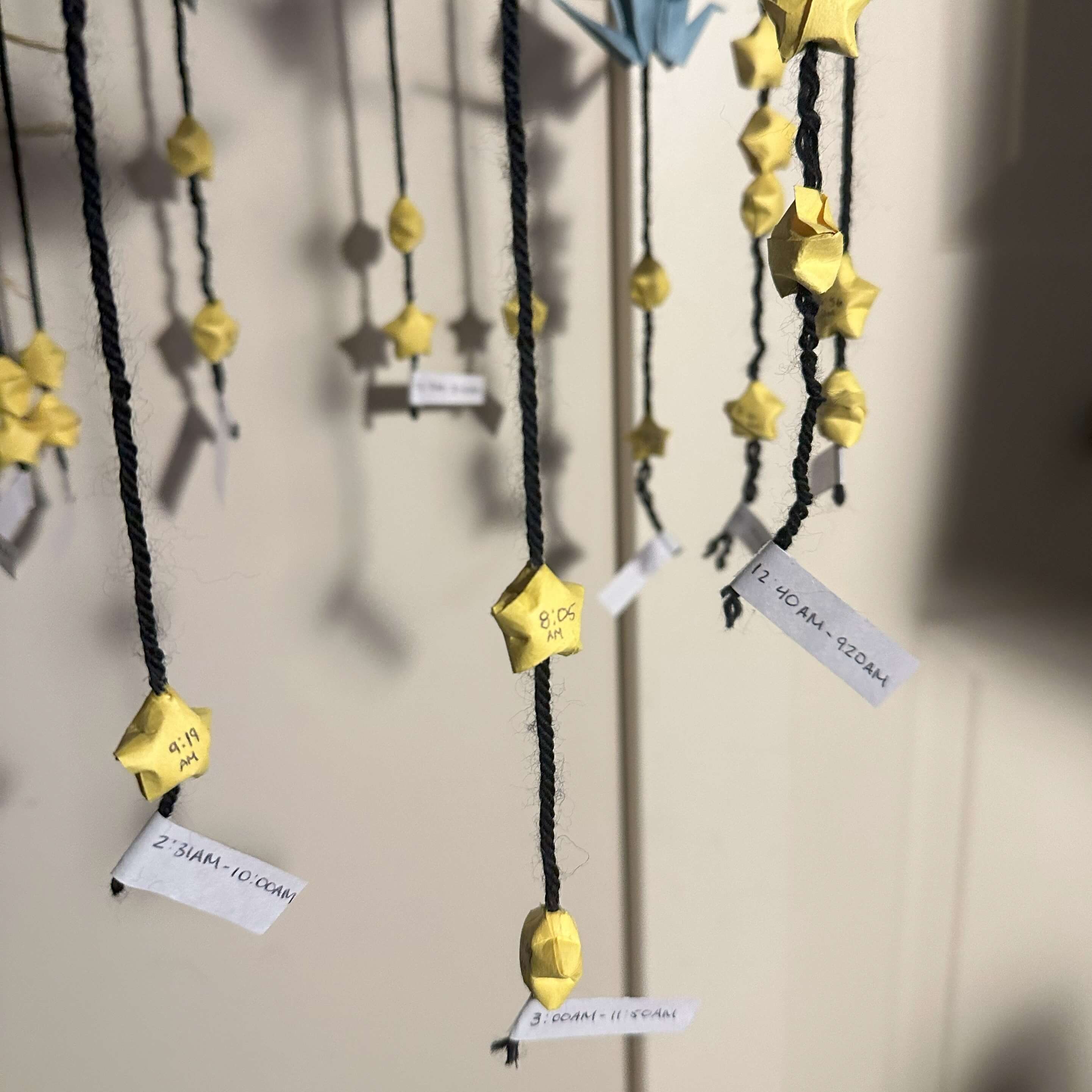
This creative approach helped visually represent not only the data points but also the emotional experience of my sleep patterns.
Reflection
This project provided valuable insights, both in terms of the data and the visualization process itself. While designing, I encountered challenges with origami textures and finding the right string to represent time intervals effectively. Some origami shapes proved too complex, and certain string types didn’t work well for the mobile. I also went through many design iterations trying to find the perfect circumference and material for the base of the mobile where all the strings attach to.
Through this hands-on approach, I learned that physical visualizations can offer an accessible and engaging way to represent abstract data. The tangible qualities of the mobile made patterns in the data more apparent than they might have been in a numerical / digital format.
Interestingly, the results didn’t support my initial hypothesis about screen time drastically impacting sleep quality. Instead, the number and timing of my interruptions during the night had a much stronger effect on my tiredness. The project also highlighted how a consistent wake-up time improved my overall sleep quality, while a late bedtime led to more disruptions and poorer sleep quality.
In the future, I aim to explore ways to reduce nighttime interruptions and set a more consistent bedtime to further improve my sleep.