Case Study: TogeTracker Grocery Assistant App
Overview
Food waste is a problem that has effects on the environment, economy, and raises questions about how our society treats food. It is estimated 88 million tonnes (that's about 265 Empire State Buildings!) of food is wasted every year, with the majority of waste coming from households which contribute 53%. All this food that gets wasted produces greenhouse gas emissions which contribute 8% to the global carbon footprint. Even though over half of the food produced ends up as waste, food security remains an issue.
-
Problem
Nearly 40% of all food is wasted and thrown out each year; that equates to about 130 billion meals and more than $408 billion being wasted every year. Food waste is associated with anyone no matter the age, however, young adults are likely to waste more food and have underdeveloped food management skills. This case study will allow us to explore the idea of a mobile application to assist users with keeping track of their perishable items.
-
Solution
Phones provide many features that could create robust and efficient solutions to HCI problems, such as voice-to-text and taking pictures. Being able to leverage features like push notifications for reminders, touch gestures like tapping,swiping, pinching, and dragging, as well as offline accessibility, would heighten the user experience when they make an inventory of their grocery purchases.
-
Role
UX Researcher
UX Designer
-
Duration
12 weeks (part time)
-
Tools
Google Suite
Figma
Miro
-
Skills
Interviews
Usability testing
Market research
Visual design
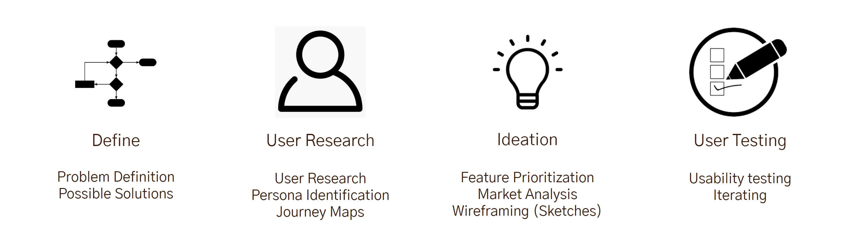
Approach
The project plan is based off of the Double Diamond design model. The first half of the project was focused on project brainstorming and understanding the users; the later half was focused on prototypes, heuristics, and final evaluations from user feedback.
Understand Users Food Management Process & Uncover Problems
Our problem is associated with everyone who does groceries, from young adults to the elderly. However, young adults are likely to waste more food and have underdeveloped food management skills. Therefore, it would be beneficial to observe young adults to get a better grasp at how the solution could ultimately save time and money for the user. If a young adult adopts our solution due to its efficiency, then other user types would follow.
For this study, we focused on young individuals who are living independently, whether it be with roommates or alone. The participants gathered were able to give a variety of answers, showcasing that not every young adult manages food in the same way. The answers provided better understanding of how the solution should be tackled.
Research Methods
-
Interviewing each participant on a set of questions allowed for systematic insights into individuals' grocery shopping patterns, with the specific objective of informing the design of key features for the application.
Example Questions:How often do you go out for groceries? Can you walk me through a step by step process of your routine of deciding what items to get? Do you make a mental or physical grocery list? If you don’t tend to create one, why not? -
Using the diary method, participants were asked to take photos of their fridge or pantry to share some insight into their food storage and inventory management practices.
-
Using ethnography, there was a bit of observing the participants grocery shop as an insight into their shopping behavior and decision-making processes.
By employing these research methods, we can gather valuable data about the grocery assistant app, including user perspectives, real-world usage patterns, and areas for improvement. This data can inform iterative design processes, enhance user satisfaction, and optimize the overall app experience.
Research Findings
Task descriptions were constructed after analyzing the responses that the participants provided from the interview. When analyzing the participants' grocery shopping process, it was discovered that there were two types of participants: structured/organized and unstructured/unorganized/forgetful.
Task Descriptions were written using two types of participants generalized from the research, user 1 is deemed an organized individual where as user 2 represents an unorganized and forgetful individual.
Sample descriptions:
Task 1 - Keep track of grocery items to get on a list
User 1, who is very organized and follows a structured, grocery shopping routine needs to create a list of grocery items to buy. The list slowly grows throughout the week, adding items when they finish something or realize they need to get. Just before they go shopping on the weekend, they do one last check throughout the kitchen, checking the cupboards and fridge to ensure their list has everything.
Discussion: Like user 1, these people are very structured in their daily house routines, creating time to plan out a shopping list throughout the week. By keeping a list, they are able to save money and are mentally aware of the food in their kitchen.
Task 2 - Reminders when products are about to go bad
User 2, a very forgetful person, is trying to not waste as much food in the house. They live a busy life and often forget to check the fridge to see what foods they have. Due to their forgetfulness and lack of object permanence, many food items go bad without them knowing. A reminder of their soon to be expired food will allow this user to plan meals around these food items. Therefore, avoiding the food going bad.
Discussion: Like user 2, a number of people live busy lives and either don’t have time or forget about items that will soon spoil. It is likely that these people also don’t find joy in throwing out and wasting food that they have bought. For these types of users it would be beneficial to remind them of the food products that will soon expire to save them from wasting food.
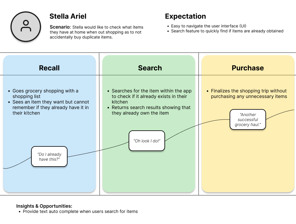
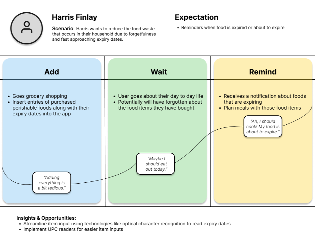
Journey Maps (hover to enlarge)
Analysis & Design
Hand-code the interviews to turn qualitative data into quantitative data. Each interview was transcribed as well as all images and any observation notes were compiled together. These finding were then analyzed to for elements that should be added into the app
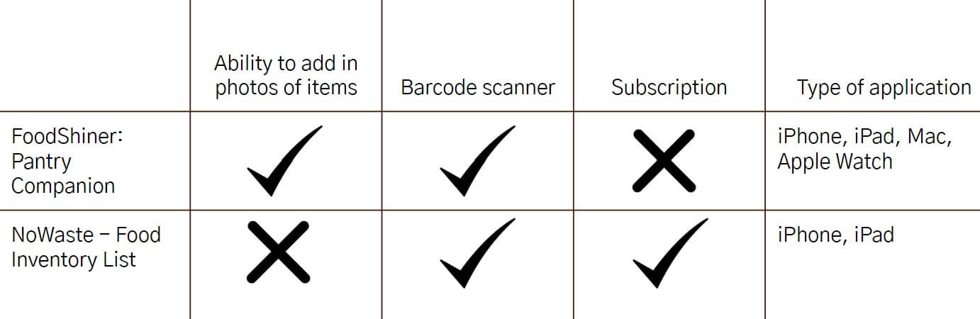
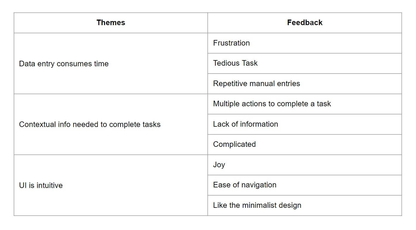
With little time available, some quick market research was done. Looking through Apple’s app store, the two most popular food tracking app were analyzed to see what features they include, what users enjoy, and what they find frustrating.
It was found that users enjoyed seeing images of their items for quick recognition, and using technology for easy data entry. Many users disliked having to pay a subscription to try and reduce their food waste.
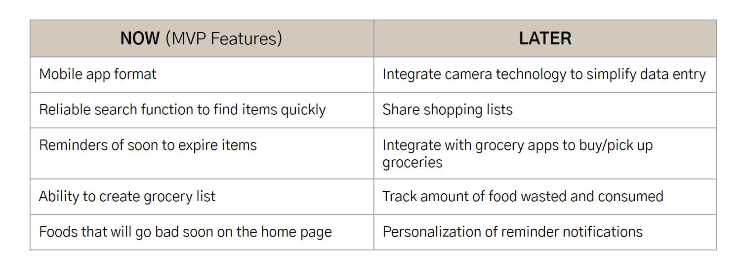
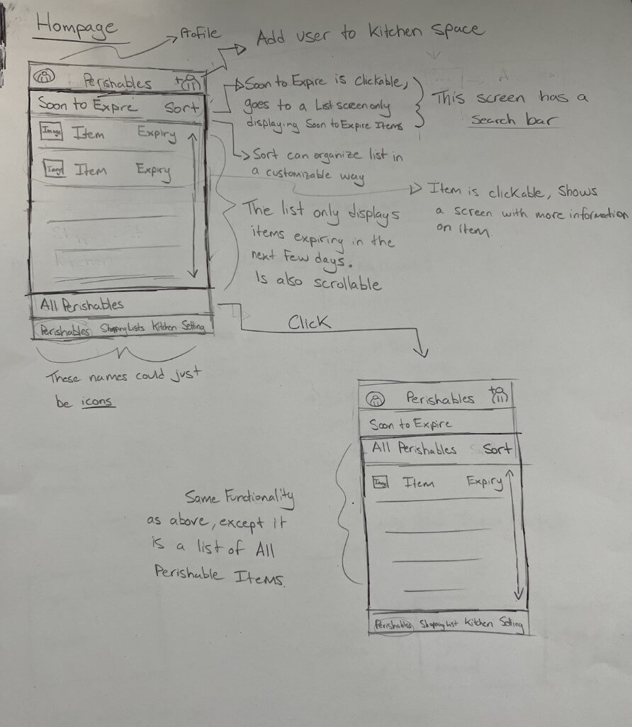
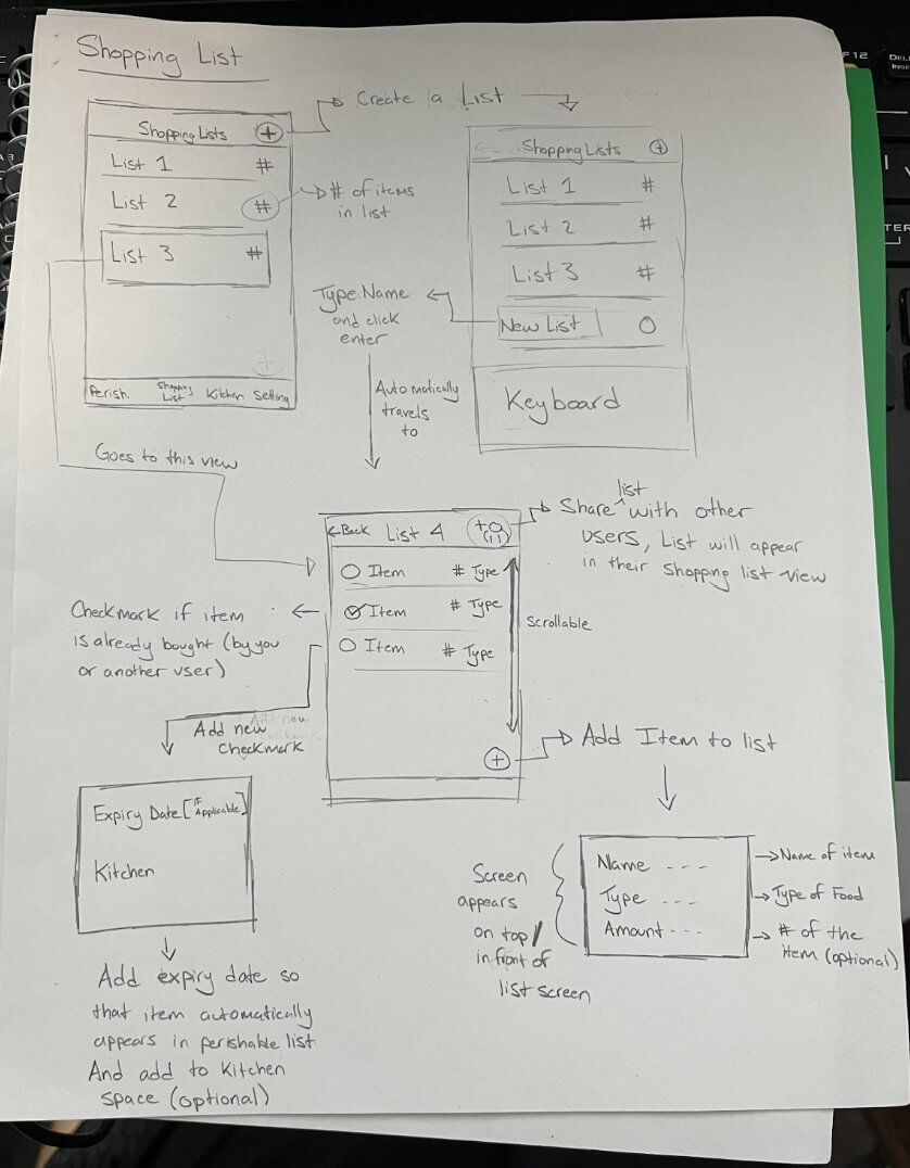
Some low fidelity sketch/wire-frames were drafted as well as a story board to tie things together.
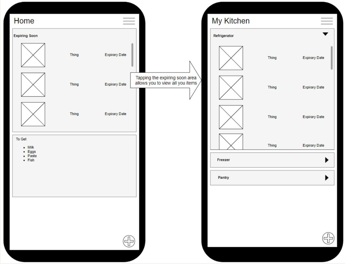
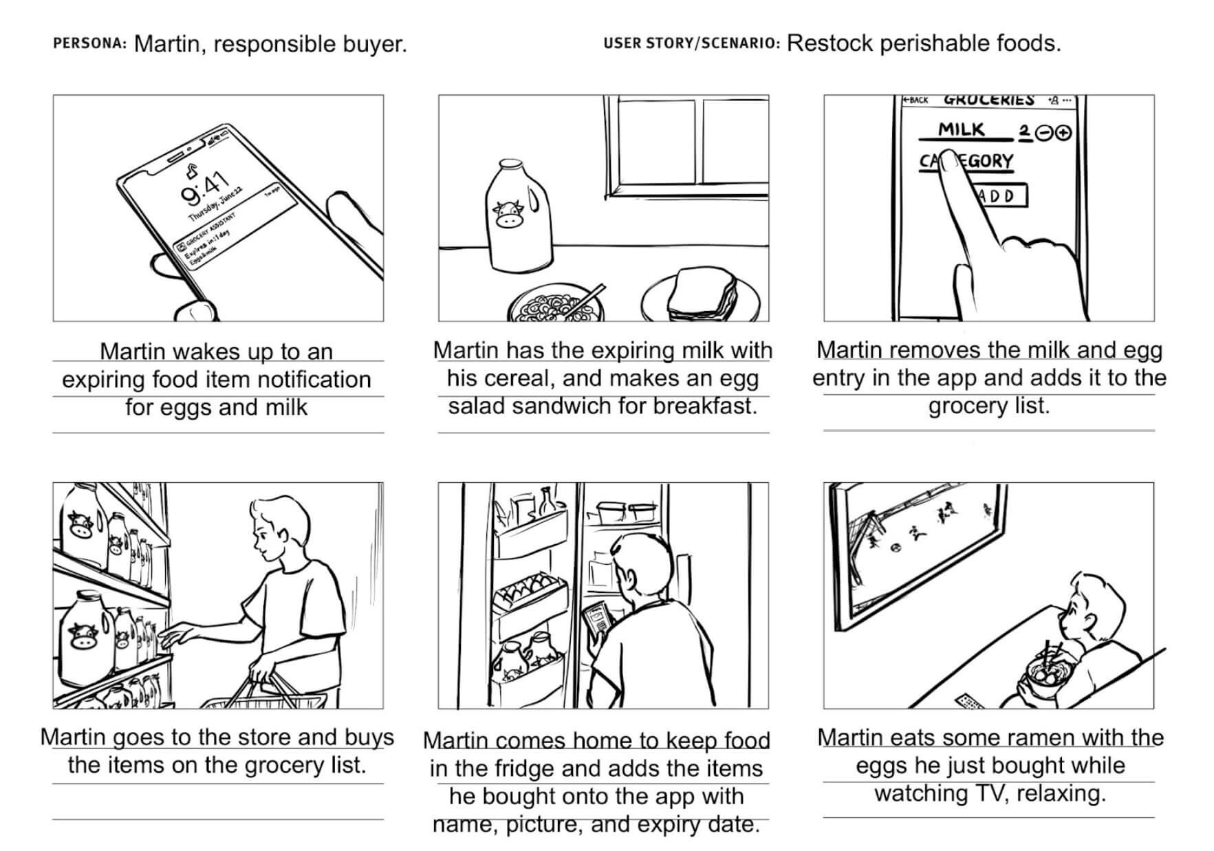
In the storyboard, the combination of two essential tasks are demonstrated: sending reminders for expiring products and maintaining a grocery list. Martin receives timely notifications about his eggs and milk nearing expiration, prompting him to consume them before they spoil. He then adds these items to his grocery list as a reminder for future purchases. When Martin goes shopping, he checks his list and buys the necessary items, updating the app to track their expiration dates once again. This integrated system ensures food freshness, reduces waste, and simplifies grocery management, enabling Martin to make informed choices and stay organized.
Participants were instructed to complete a set of tasks while working through a photo series of the high-fidelity prototype. This allowed research into assessing the user experience and identify any usability issues or areas for improvement. You can also try the medium fidelity prototype if you'd like.
Heuristics, User Testing, & Feedback
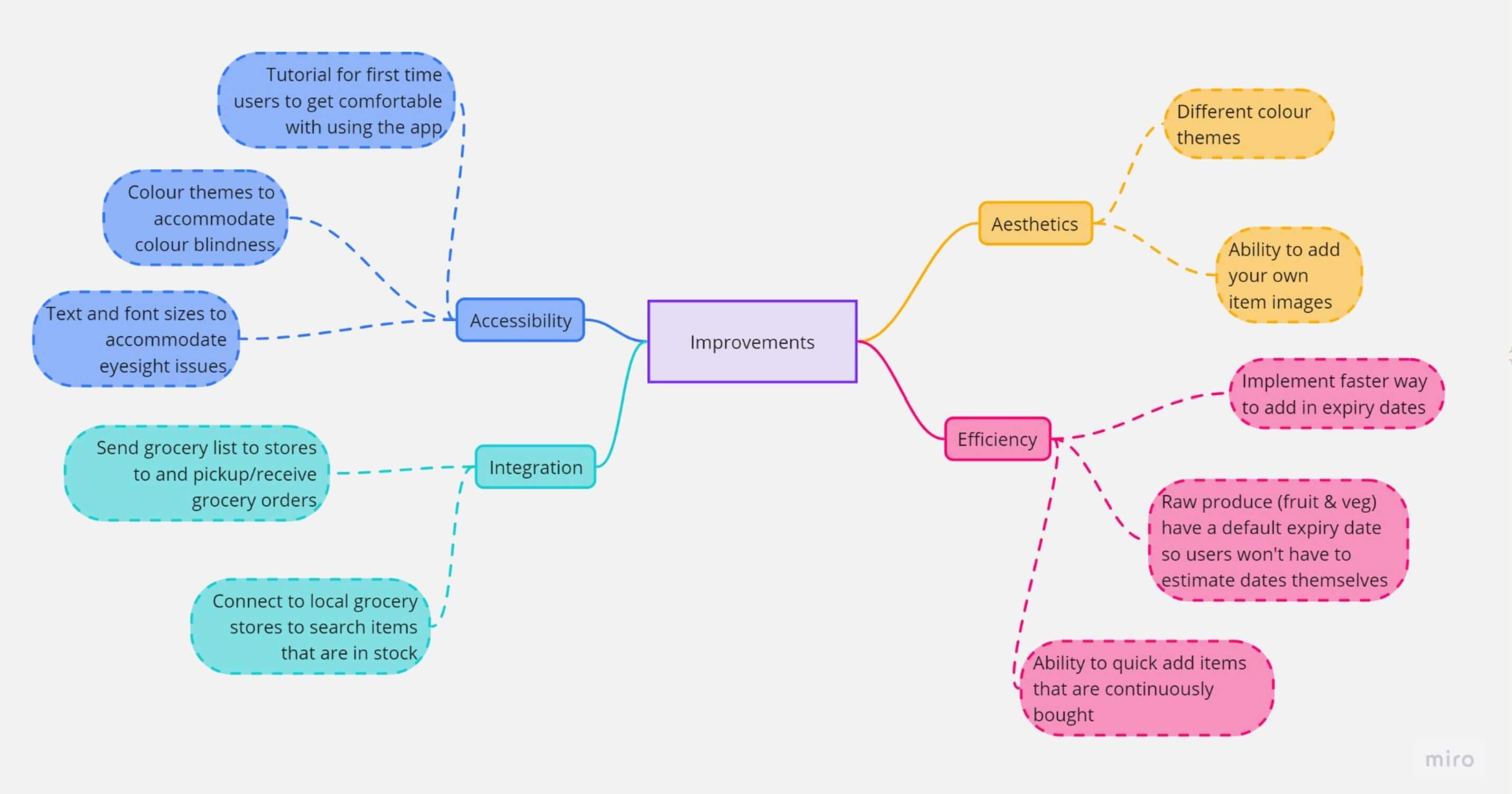
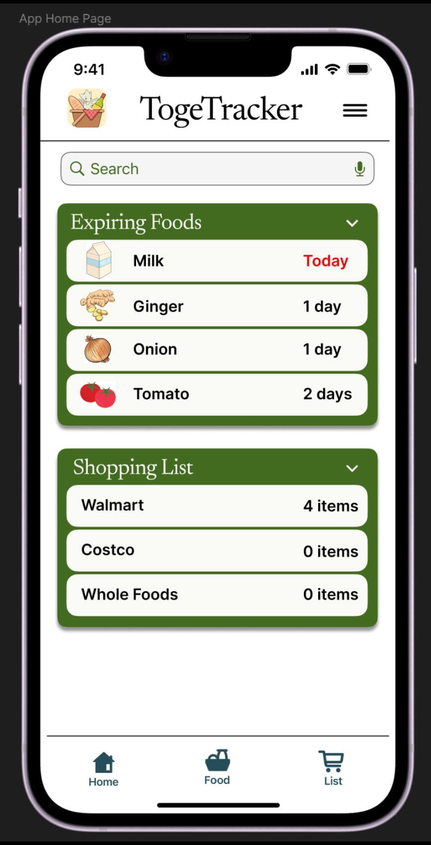
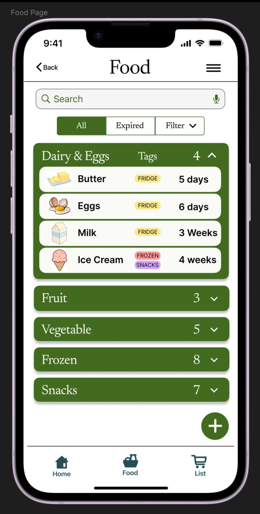
With extra time, after looking at the feedback and he analysis done earlier, I redesigned the home and food pages to have a more clean and cutesy look.
Reflection
An issue that came up was the lack of diversity in test participants. Almost all of the participants who took part in user research and testing were young adults that were also students. Having missed out on other demographics, such as older groups of people, important insight from users who may not have been as familiar using a smartphone or mobile apps may have been missed. Another important demographic missed were users with impairments. As such, there was no testing to see how accessible it would be for these users.
The research participant size was very small, the participants would at times contradict each other when it came to introducing/changing/removing features. There wasn’t a strong trend to infer on when it came to what steps should be taken regarding certain features.
With the short time frame of the project, not all features were able to be implemented, especially for the high fidelity prototypes. This left gaps in places within the functionality of the application. As a result, the prototype testing was either guided or had participants performing specific tasks. While the time constraint was rather short in comparison to a real world scenario, this still may have been a sign of attempting to create too many features within the initial prototyping stage.